Pagoda Labs
Designing a mobile app for a SaaS client
Skills
Mobile App Design
User Flows
Interaction Design
Developer Handoff
Tools
Figma
Duration
2 months
My Role
UX Designer
Pagoda Labs is a SaaS platform that provides small businesses, particularly service-based businesses like barbershops and nail salons, with a digital infrastructure to manage bookings, operations, and a website. Their platform is designed to streamline business operations and attract new clients for businesses with little-to-no technical knowledge. Pagoda Labs aims to empower businesses to transition from legacy systems or pen-and-paper to a unified, flexible digital experience.
Who is Pagoda Labs?
For one of Pagoda Labs’ clients, I designed a mobile app that aligned with Pagoda’s existing platform flow while introducing a flexible white-label solution for future clients. Using Pagoda’s pre-existing design system, I created the full booking journey along with an appointment lookup feature for viewing or canceling appointments. I explored three levels of branding customization, from fully Pagoda-branded to fully client-branded, and Pagoda selected a hybrid approach that preserved Pagoda’s identity while reflecting their client’s brand. The designs were handed off to development, and the app is slated for release in April ‘26.
Summary
Problem
Slice Garage did not have a centralized digital presence, creating friction for both customers and the business. While Instagram was effective for discovery, it lacked the structure needed to communicate the brand story, support merchandise sales, or handle catering inquiries in a consistent and scalable way.
For customers, this meant uncertainty around legitimacy, offerings, and how to engage beyond attending pop-up events. For the founder, it resulted in operational overhead, managing inquiries through DMs, lacking brand consistency, and having no long-term platform to support growth. The challenge was not simply to build a website, but to design a digital foundation that included a style guide and brand assets while being easy to maintain for a small business.
-How might we create a mobile booking experience that fits Pagoda Labs platform flow, supports multiple levels of client branding, and provides a smooth end-to-end appointment journey?-
Solution
The solution was to create a digital hub that allows Slice Garage to gain trust from new customers and build relationships with returning customers while supporting merchandise sales and streamlined catering inquiries. The website needed to feel intentional and expressive, while remaining simple.
The final solution included:
A responsive website that communicates Slice Garage’s brand and story
A lightweight e-commerce experience for merchandise sales
A centralized contact form to streamline catering and general inquiries
A branding system to ensure visual consistency
The site was built on Squarespace to balance accessibility, cost, and maintainability, allowing the founder to make updates on their own.
Research
I conducted stakeholder interviews with Slice Garage’s founder to understand the business goals, operational constraints, and priorities that would shape the website’s design:
Stakeholder Interviews
Mobile discovery
Merch sales stream
Customers primarily engage with Slice Garage on their phones, shaping how content needed to load, flow, and prioritize information
Merchandise was important, but needed to feel additive to the brand rather than the site’s primary focus
Founder autonomy
Streamlined intake
Ongoing design or technical support was not feasible, requiring solutions that could be managed independently
Manual outreach created inconsistent information and follow-up, increasing unnecessary load for the founder
When discussing brand direction for the website, the founder emphasized simplicity and usable content over fluffed design:
“I would love a simplistic website with automobile flair that lets the content speak for itself.”
I reviewed sites from local and similar pop-ups to understand best practices and identify opportunities. The review focused on branding, e-commerce integration, and clarity of CTAs like ordering or contacting the business.
I grouped insights into patterns:
Competitor Analysis
Social media forward
Most pop-ups rely heavily on Instagram for discovery, making it difficult to find reliable or current information
E-commerce as support
More effective websites showcased merchandise as a secondary factor compared to brand experience
Storytelling over quantity
Strong visual identity often reflects trust and reliability, while dense or scattered navigation creates friction
The research process clarified a focused design approach for Slice Garage’s website, prioritizing brand expression, clarity of action, and simplicity over excessive content and features.
Design
Design work began with low-fidelity wireframes to establish structure and content hierarchy, followed by the development of a lightweight brand system and supporting templates. Each step was guided by the goal of creating a site that felt intentional and expressive while remaining simple to maintain.
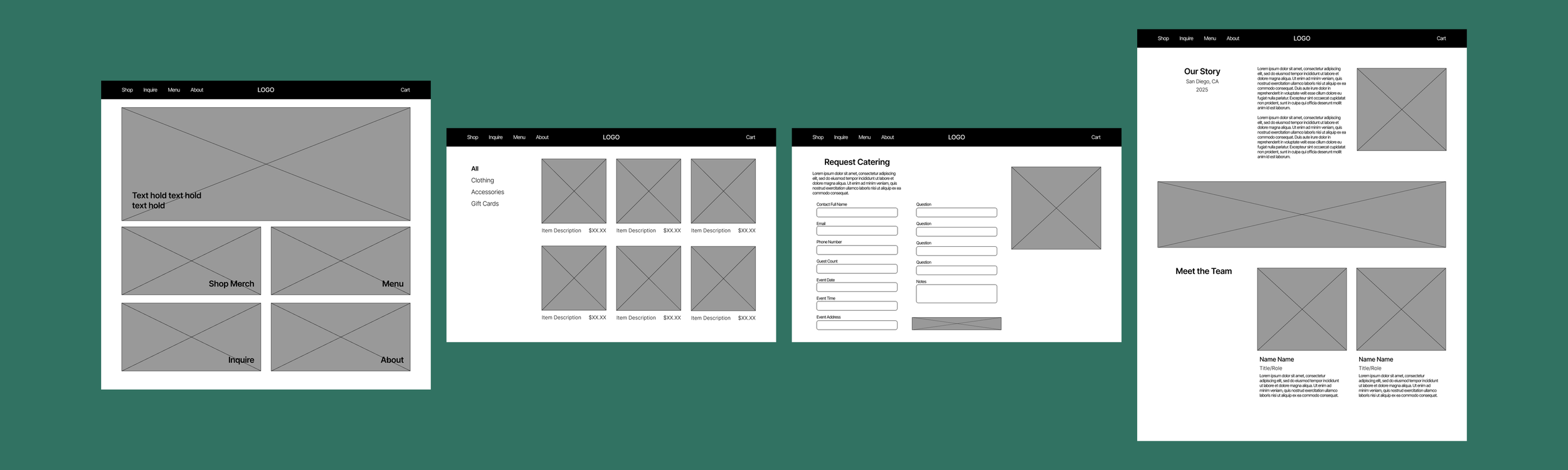
Based on the gathered insights, I started designing low-fidelity wireframes with a focus on mobile-device readiness, simple opportunities to showcase the brand, and easy updating.
Low-Fidelity
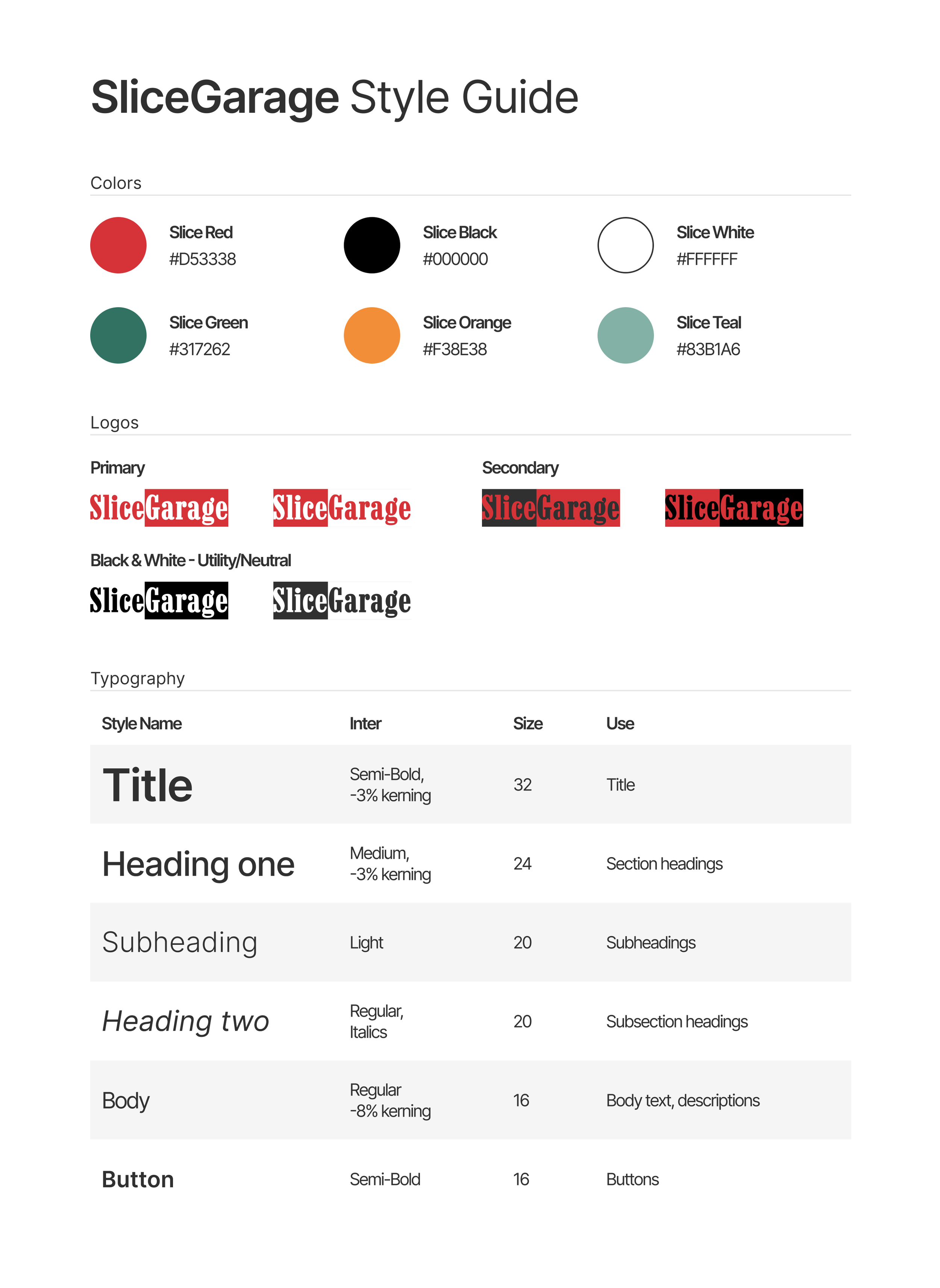
Following wireframes, I developed a style guide that included colors, typography, and iconography to lead consistency across touchpoints.
Style Guide & Branding
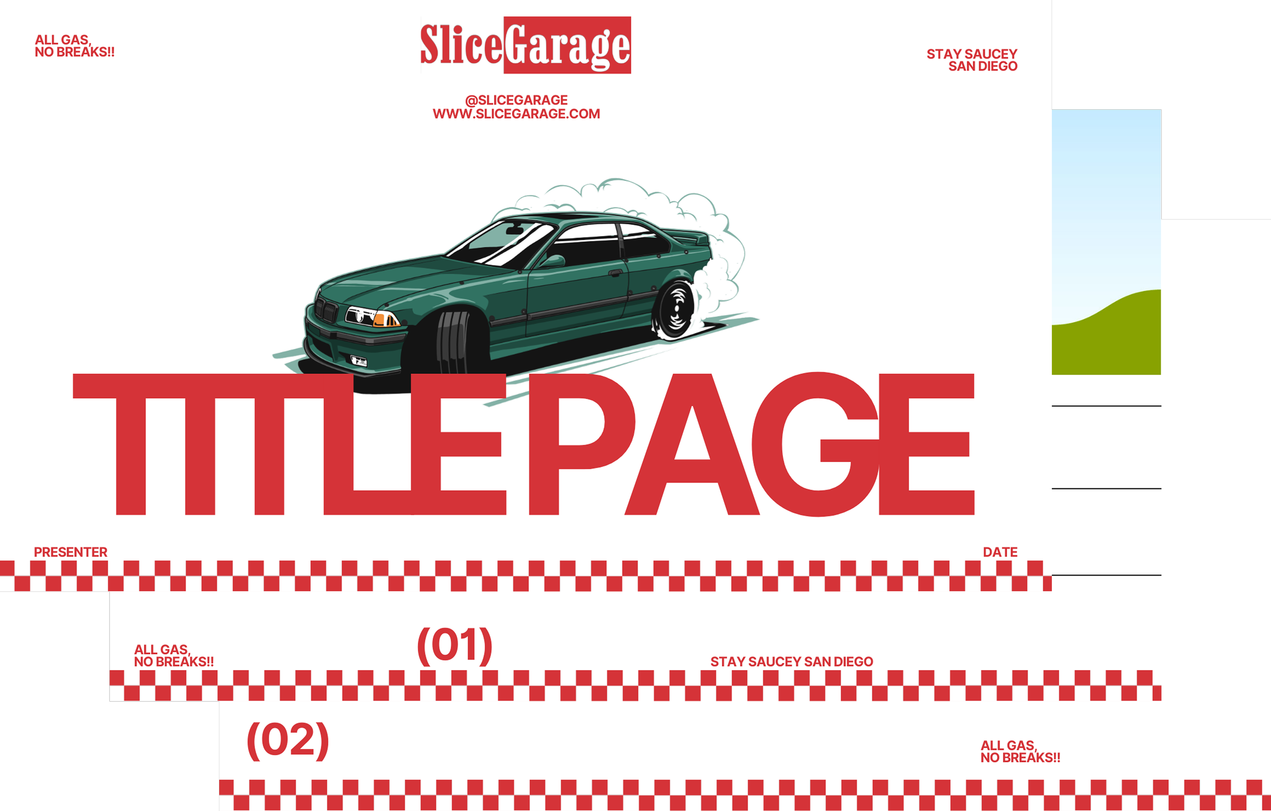
Presentation Deck Template
I also included a presentation deck for use cases including event pitches and catering proposals.
Deliver
The final designs turns research and exploration into a polished, responsive website that reflects Slice Garage’s personality while remaining functional, accessible, and easy to maintain.
Final Designs
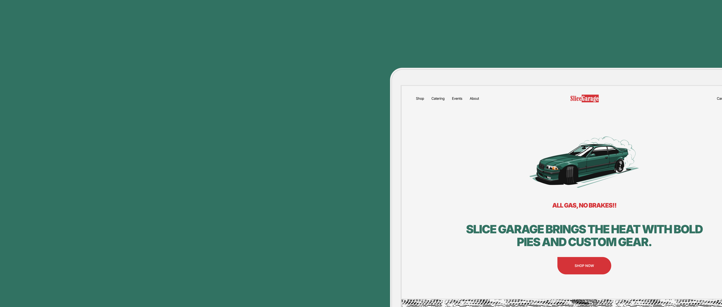
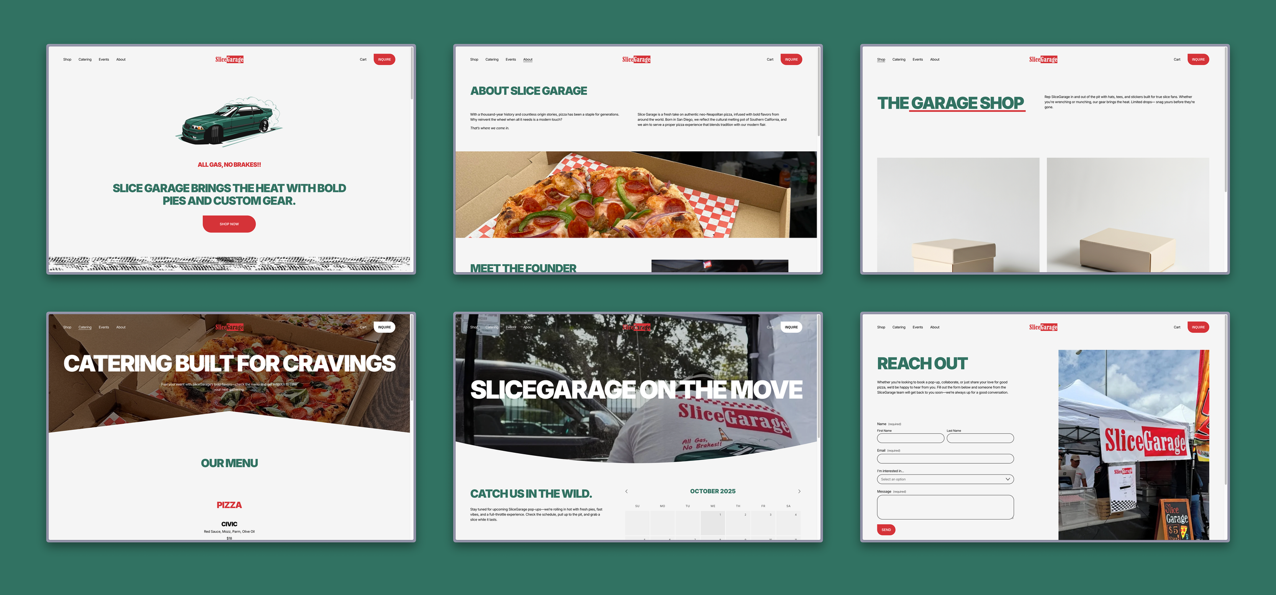
Homepage
The homepage was designed as a brand statement rather than a traditional marketing page by intentionally limiting CTAs to avoid overwhelming visitors
Garage Merch Shop
The e-commerce experience was designed to be lightweight, allowing merchandise options to be easily rotated by the founder without affecting brand identity
Contact Forms
Contact forms are included at the bottom of most pages to centralize inquiries while staying accessible in the moments users are most likely to reach out
Wireframes turned into real web pages using the new branding kit paired with client-provided images.
Web Designs
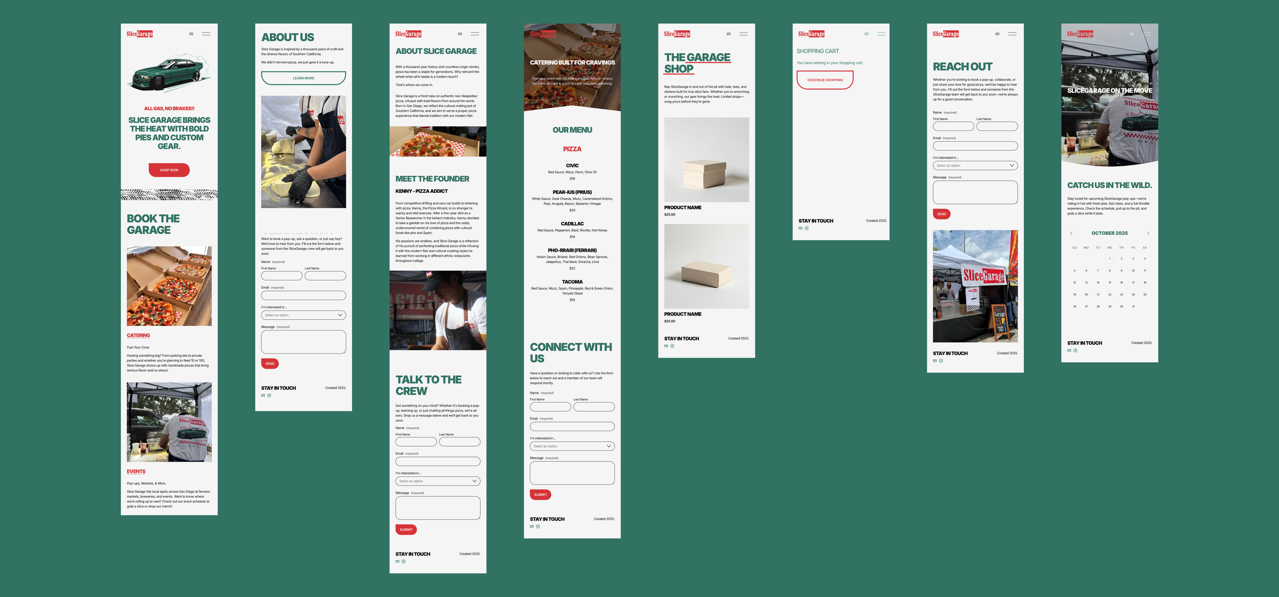
Mobile website designs were prioritized to reflect how most users encounter the brand in real-time at pop-ups or events.
Mobile Designs
Several decisions were made to intentionally exclude features like media, animations, and longer written content. These helped to keep the site lightweight, professional, and sustainable for the founder to manage and update independently.
Because the site had not yet launched at the time of delivery, success was evaluated using qualitative criteria aligned with project goals, operational constraints, and client feedback.
Brand alignment: the site consistently reflects Slice Garage’s tone, visual identity, and personality across all pages
Navigation clarity: visitors can quickly identify key sections with minimal choices and no competing CTAs
Responsiveness: core interactions and visual hierarchy translate cleanly across desktop and mobile
Maintainability: the site was built on Squarespace for the founder to make updates independently without ongoing design support
Client satisfaction: the founder expressed high confidence in using the site and brand kit, allowing him to focus on what he knows best—pizza!
Outcomes
Working closely with a single stakeholder reinforced the importance of listening deeply before designing. This project helped me practice balancing creative freedom with constraints while designing both a website and brand identity. It also shaped how I approach future work by grounding design choices in what will actually be sustainable long after handoff.